Aussies love their gin. Such is our love for gin that over 300 distilleries have launched in Australia over the past decade, with industry predicting 1 in every 5 bottles of gin consumed will be made locally. That’s a hefty amount of competition so there’s a lot of pressure to find white space from market position to packaging on the shelf.
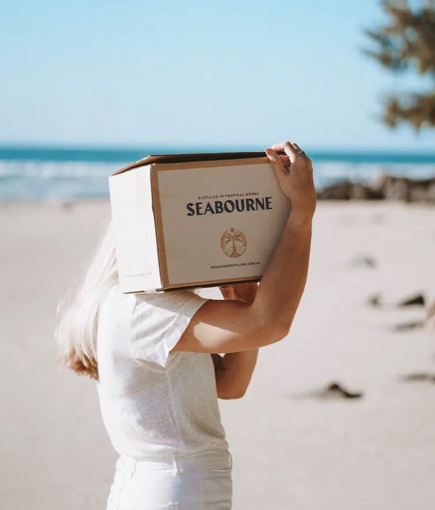
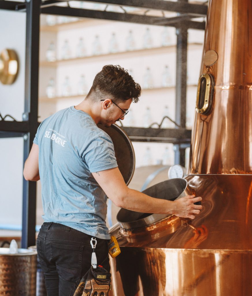
We brought to life this unassuming distillery nestled away in Queensland’s tropical paradise of Noosa in a way that captured the essence of what it is to live between the waves and the rainforest.
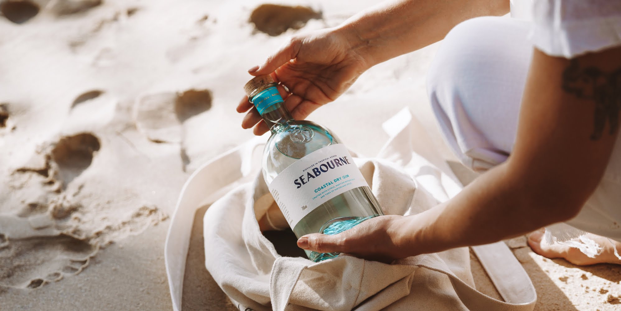
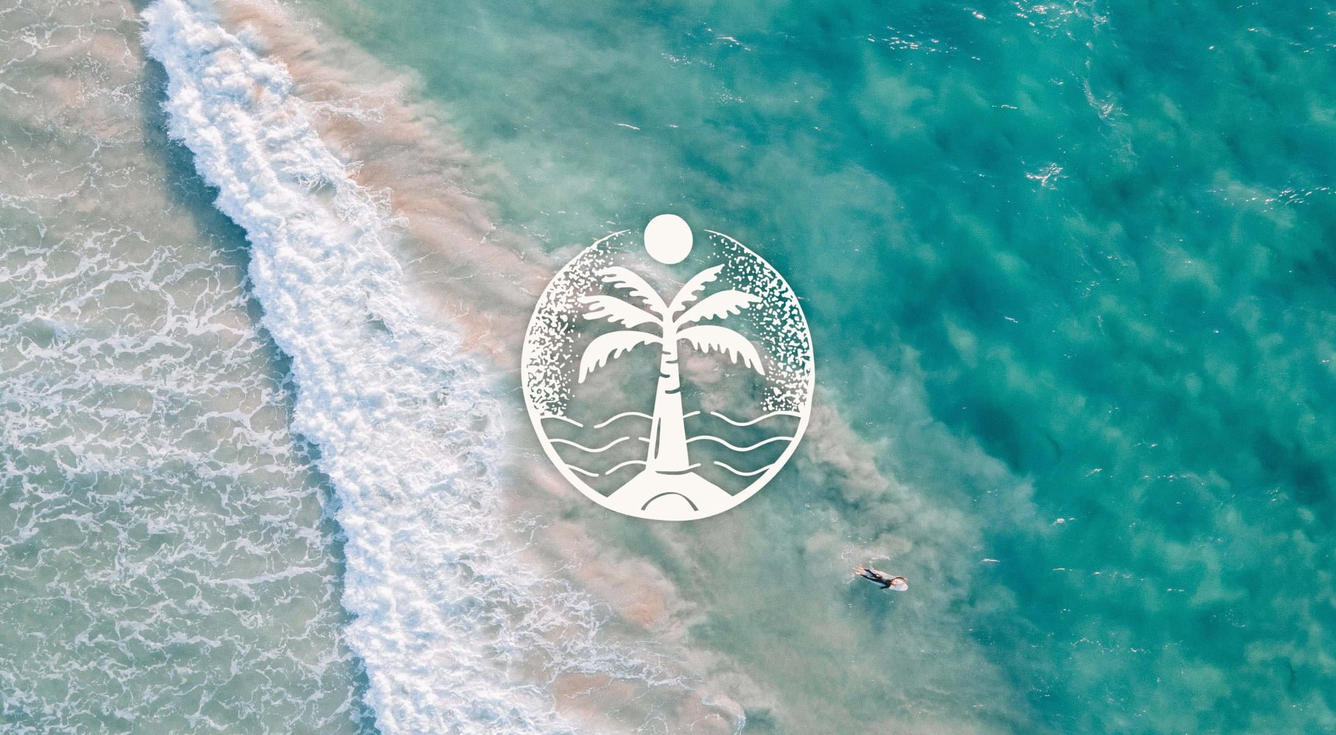
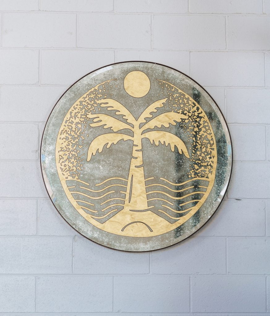
Seabourne. A name that reflects the crossroads of Noosa, where the rainforest meets the sea, where past traders and modern explorers unite to sip the remains of the day away under the shade of a palm overlooking the ocean. Eternally brought to life through the brand mark and tagline.
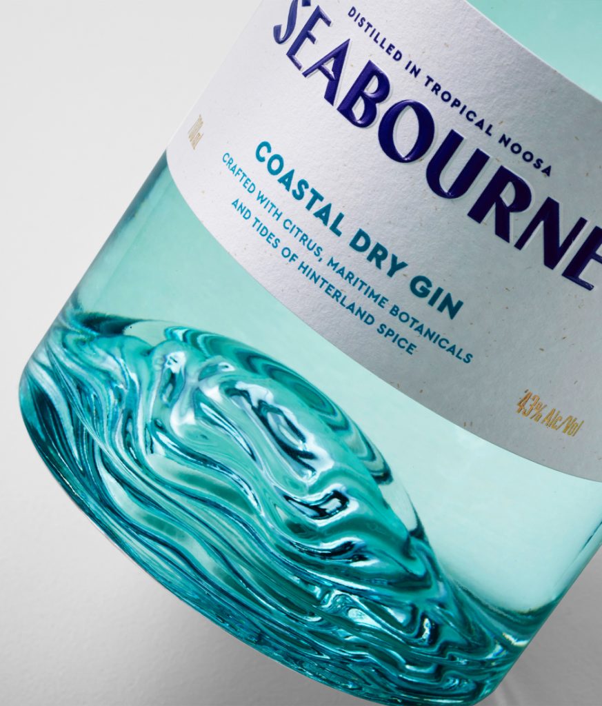
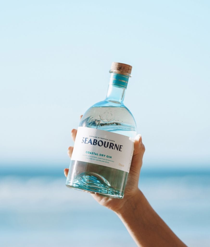
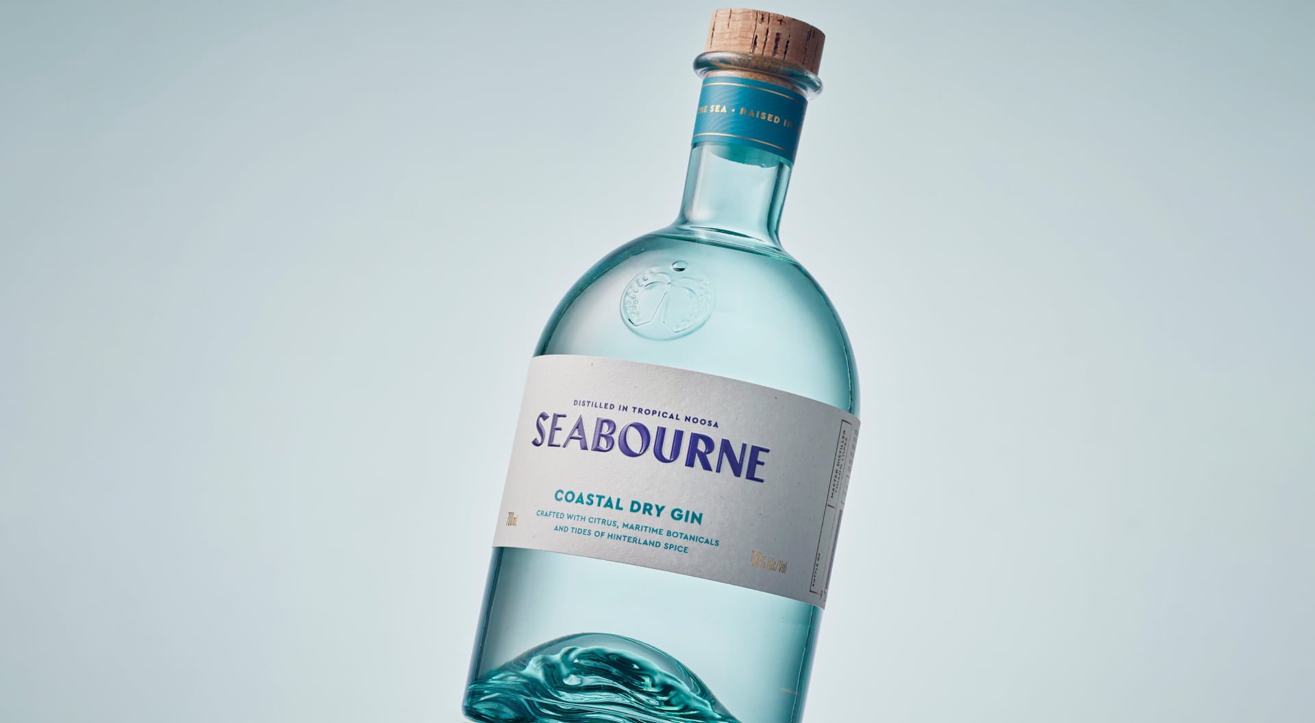
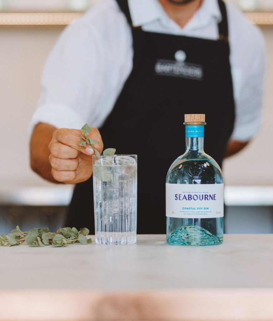
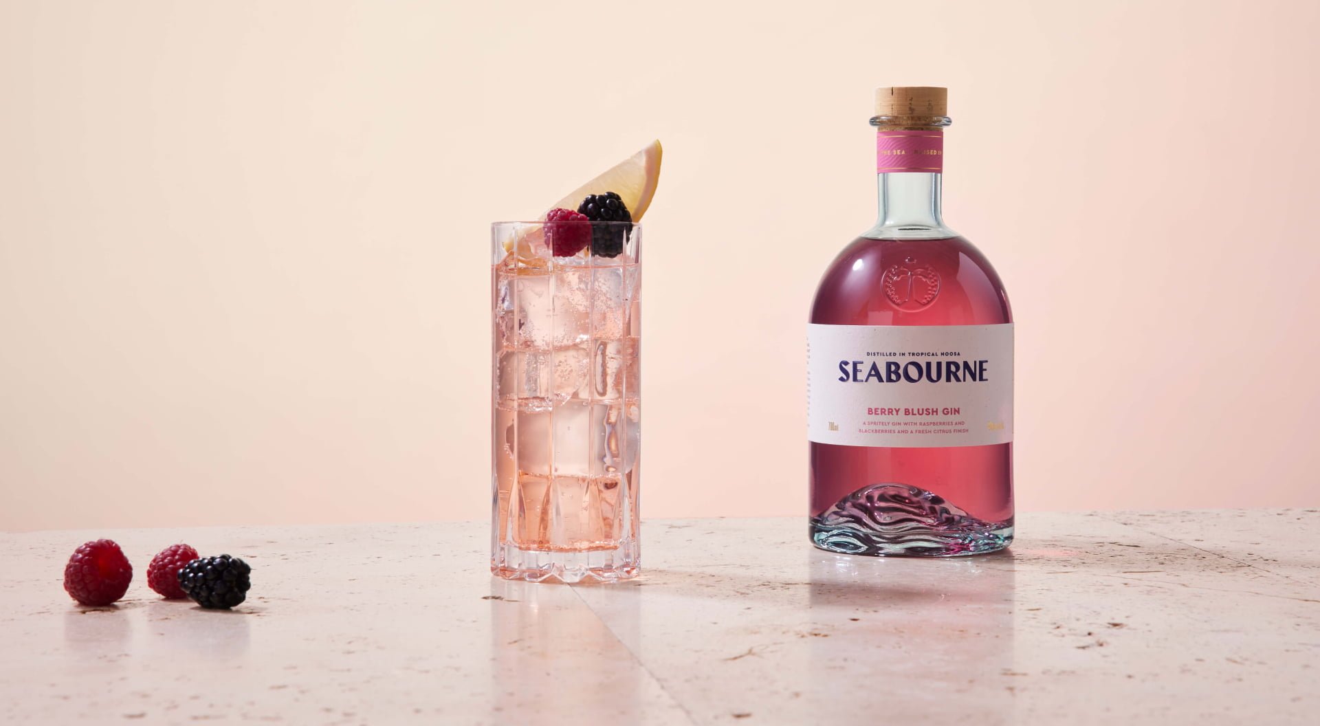
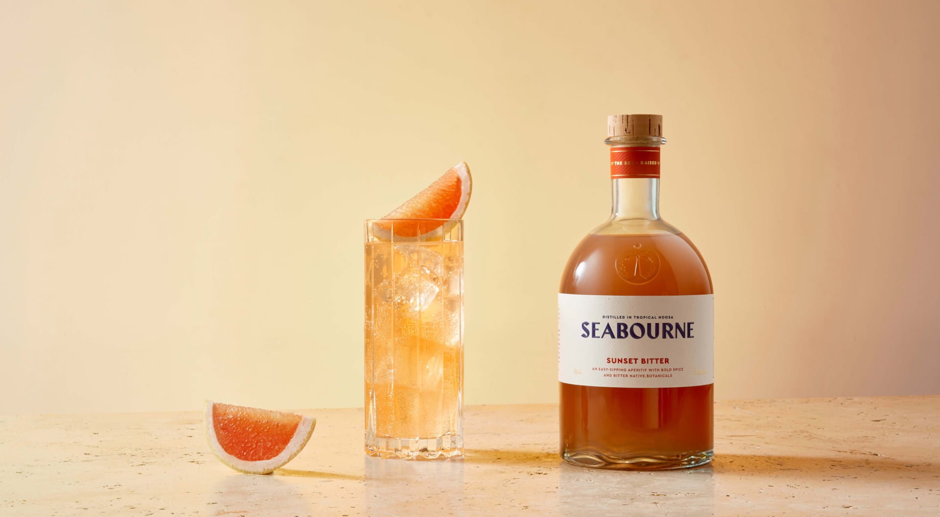
When it came to bottling the essence of tropical Noosa, it felt natural to turn to the elements. We wanted to lean into the feeling of radiant sun-filled days, and the cool canopies of rainforest and hinterland that flank the town with abundant beauty and natural botanicals. The big question was—if you held Noosa in your hands, what would it feel like? The answer needed to be a bespoke sea-blue bottle designed with an internal ‘wave’ punt feature that emulates the ripples of Noosa’s fairy pools.
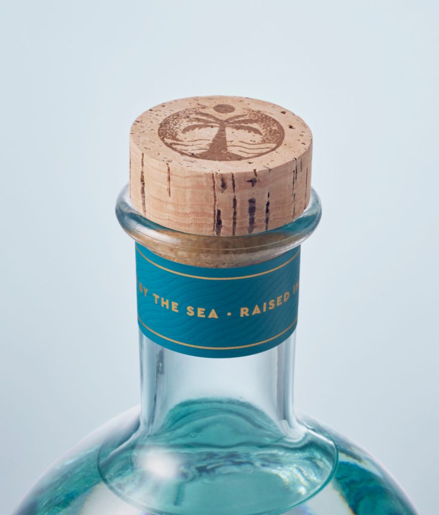
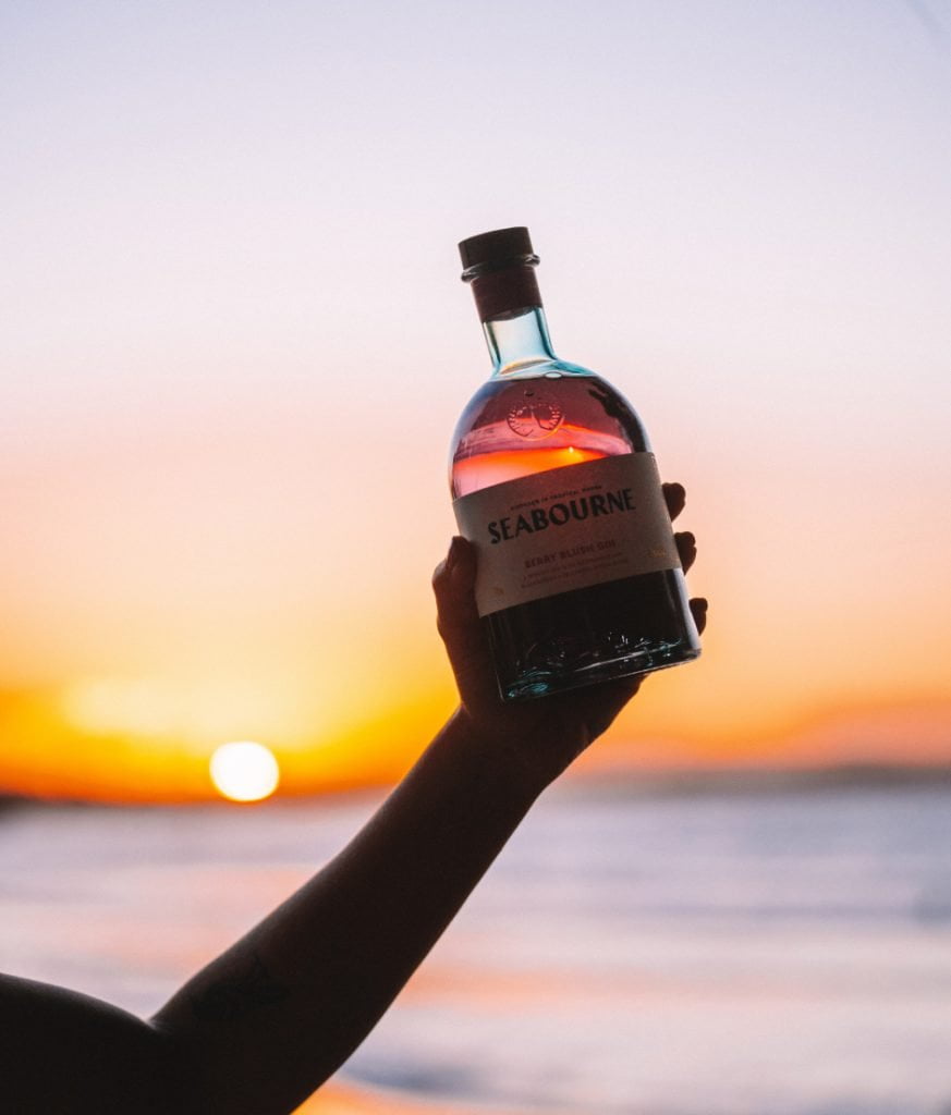
Like the ocean on a hot January day, this bottle is endlessly inviting, made to gleam on the shelf –Especially when light shines through with shimmers of blue that glorify the crisp liquid inside. All finished with a natural cork stopper that completes the maritime coastal concept.
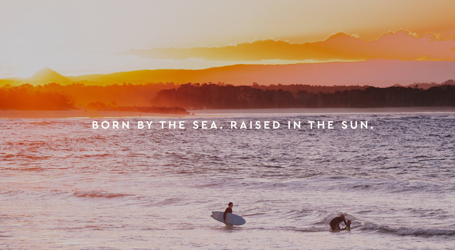
A product as unique as Seabourne needed a website to match so we started by embracing the element that inspired the name: the sea. Immersing visitors at first sight with an expansive video banner that welcomes them with a flyover of sand, surfers and fresh cocktails, instantly setting the scene for the story to be revealed as the site is further explored.
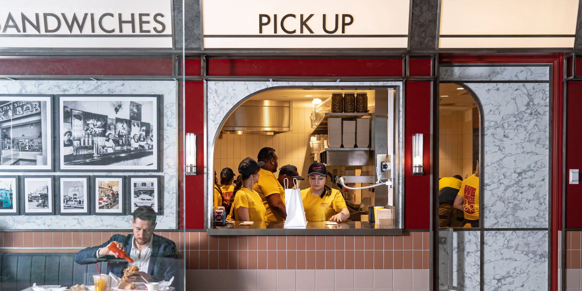
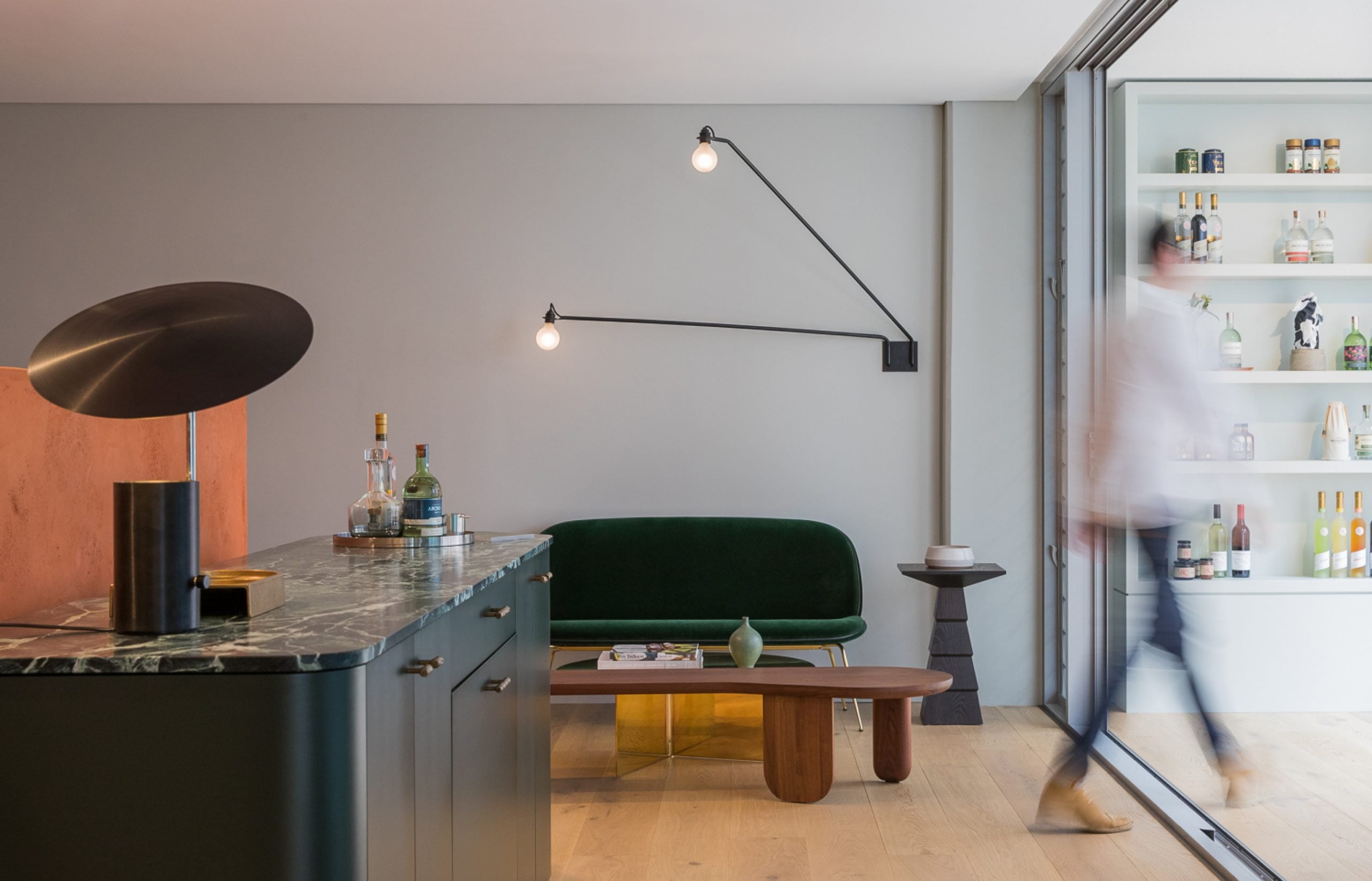
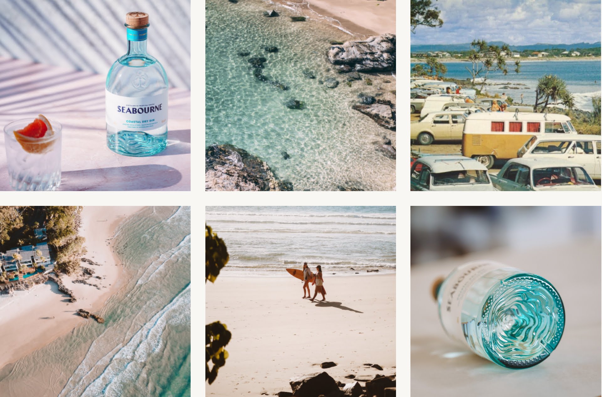
The distillery, cellar door and bar rounds out the Seabourne story with a contemporary coastal design that is sprinkled with light-touch branded moments.
The final result is an iconic bottle and branding that transfixes and transports people from where they are to where they’d rather be.
San Francisco World Spirits Packaging Design Competition 2022
Gold
Design & Packaging Master Awards 2021
Master, Gin Category
Lifestyle Photography: Jac Lee Media
Photography: Product Photography Sydney
Lifestyle Photography: Jac Lee Media
Photography: Product Photography Sydney
Sign up to be the first to know about updates, new projects, and all things SQUAD.