Padre had strong foundations, but as the business expanded, there was an opportunity to create a more consistent and distinctive brand experience.
Packaging needed greater shelf presence, retail environments needed a stronger point of view, and the broader identity needed greater flexibility across channels. With new venues, products and markets ahead, Padre needed a system that could scale while retaining the warmth and approachability people already loved.
Built around ‘The Full Spectrum of Specialty Coffee’, we created a connected brand platform that captures Padre’s breadth of expertise while staying true to its philosophy: great coffee, done properly, without the ego.
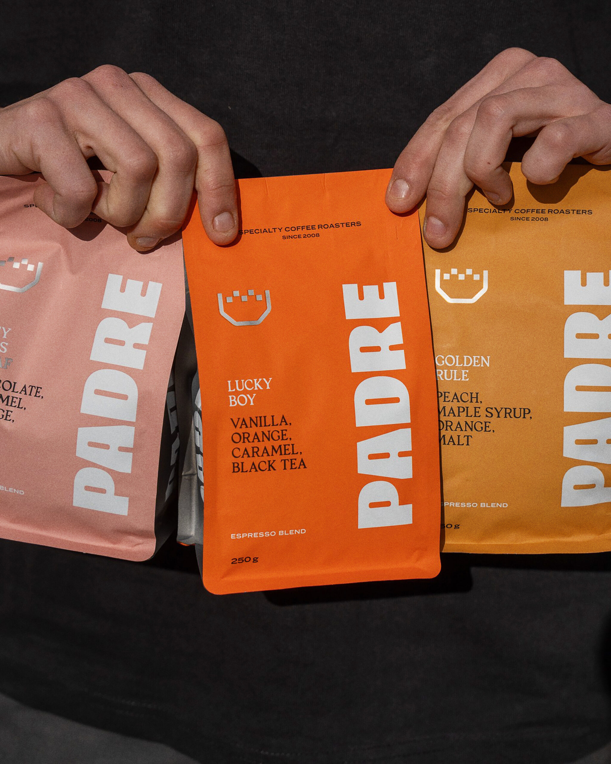
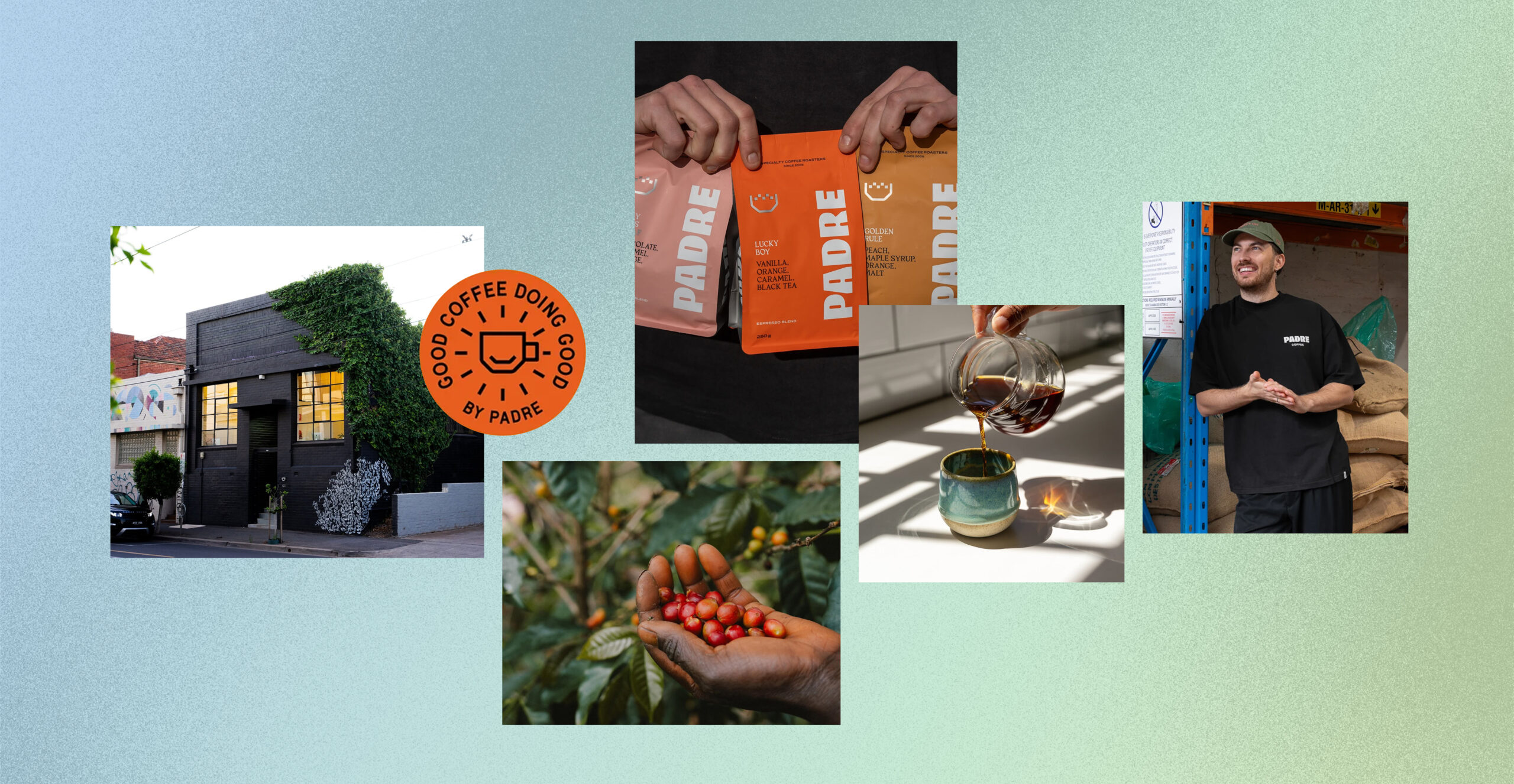
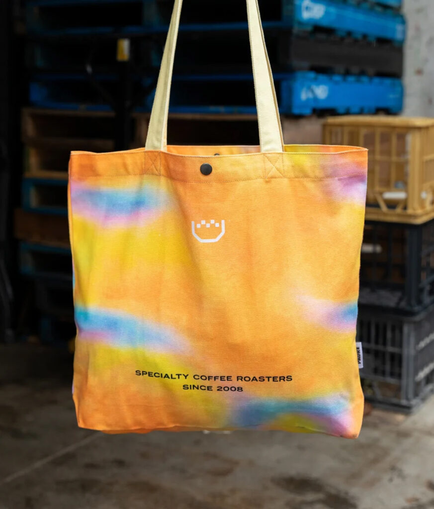
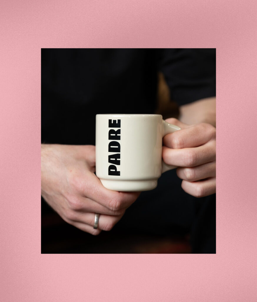
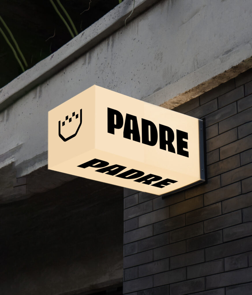
We built on Padre’s existing equity, retaining the crown as a familiar anchor while evolving the wordmark, typography, colour and packaging into a bolder, more expressive system. The new packaging strengthens distinction across blends and Single Origins, improves navigation and puts flavour front and centre.
The brand evolution moved beyond the pack and into the physical experience. We developed a Retail Experience Playbook to guide venue upgrades and future expansion, creating consistency across interior aesthetic, merchandising, F&B, service and product storytelling.
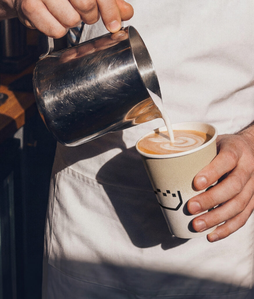
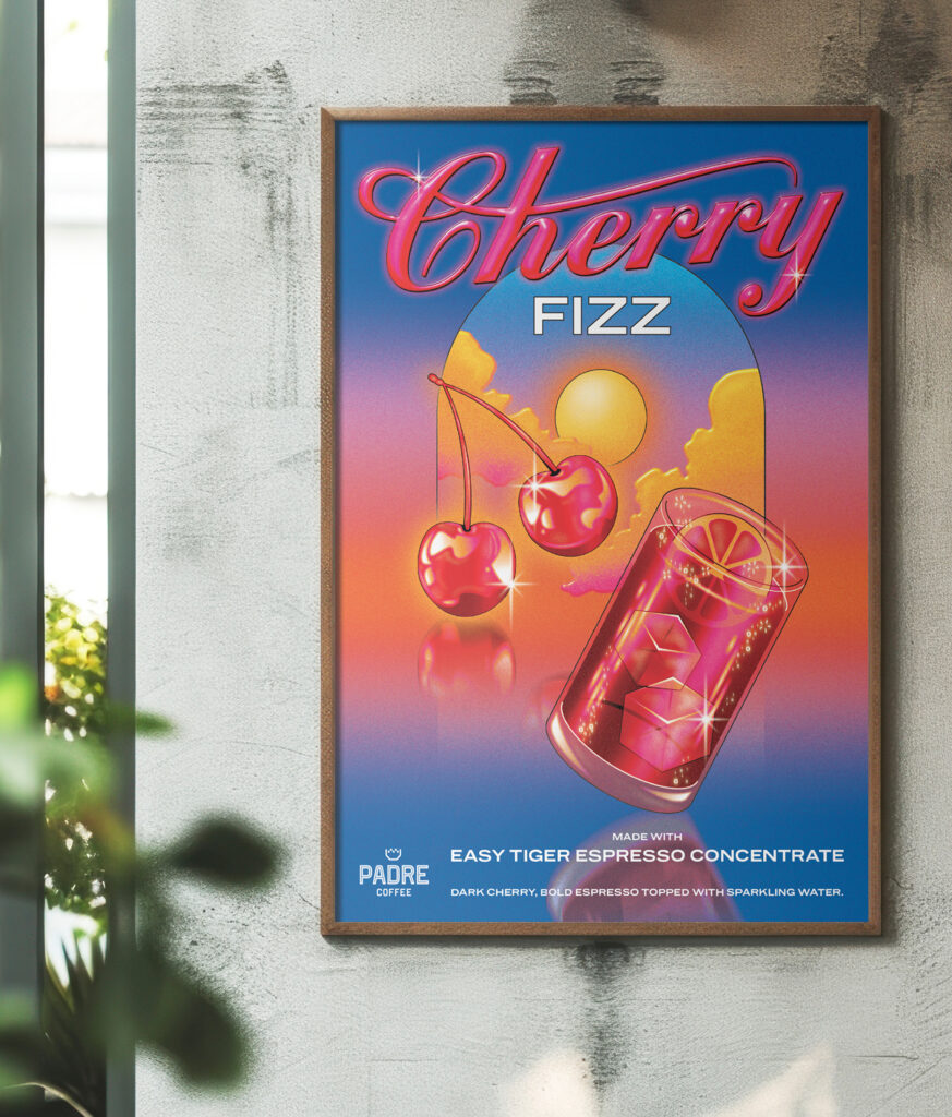
We also developed a seasonal beverage program to build excitement and drive commercial performance, launching with Easy Tiger Cherry Fizz. Using Padre’s coffee concentrate, the serve cuts preparation from around two minutes to just 30 seconds, delivers up to 30% stronger margins and requires no espresso machine or barista.
Art Direction
Brand Identity
Brand Strategy
Campaigns
Drinks Consultation
Key Messaging
Packaging
Signage
Venue Experience Consultation
Sign up to be the first to know about updates, new projects, and all things SQUAD.